译自:Coloring Buttons w/ ThemeOverlays & Background Tints
如果我们想改变Button的背景色background color,一般如何实现?
本文将介绍两种实现方式。第一种是使用AppCompat的Widget.AppCompat.Button.Colored样式并自定义ThemeOverlay来直接修改Button的背景色,而第二种方式则是使用AppCompat的built-in background tinting support来实现同样的效果。
方式#1:通过ThemeOverlay方式修改
前面讲得有点空泛,在此之前我们先来了解下按钮的背景颜色是如何决定的。material设计规范对在light and dark themes中的按钮应该是什么样子有非常具体的要求。那么这些需求在底层是如何被满足的呢?
The Widget.AppCompat.Button button styles
为了回答上面所提出的问题,我们首先需要对AppCompat是如何决定一个标准按钮的默认外观有一个基本的理解,AppCompat定义了大量的由Widget.AppCompat.Button派生出来的style样式,作为各种按钮的默认外观样式,在Android中,每一个View必须有一个默认的外观。也就使得framework可以为每一个控件应用一系列默认属性值,达到了更好的用户体验。对于按钮Buttons,默认的Widget.AppCompat.Button样式有以下特性:
所有
Button的最小宽高minimum width、minimum height默认都是相同的(根据material设计规范分别指定为88dp和48dp`)所有
Button的TextAppearance默认相同(例如:所有大写字母的文本默认字体和大小全都一致)所有
Button的background默认相同(例如:相同的颜色、圆角角度、相等的insets和padding值等)
Widget.AppCompat.Button确保了所有Button默认情况下看起来大致相同。但是这些特性例如按钮背景色在Light和Dark主题下又是如何被取决的,又或者是诸如disabled, pressed, and focused等状态下的情况呢?对于这些,AppCompat主要取决于以下三种不同的属性(theme attributes):
R.attr.colorButtonNormal:决定按钮在普通状态
normal state下的背景色,light themes主题下为#ffd6d7d7,dark themes主题下为#ff5a595b。android.R.attr.disabledAlpha:浮点数类型,决定控件disabled 状态下的alpha值,
light themes和dark themes主题下分别为0.26f、0.30f。R.attr.colorControlHighlight:决定当控件被按下
pressed或者获得焦点focused时,绘制在控件顶部的透明悬浮层的颜色translucent overlay color(在post-Lollipop中的Ripple效果或者pre-Lollipop的list selectors的前景色foreground),在light themes和dark themes下分别表现为12% black和20% white(#1f000000and#33ffffff)。
AppCompat在背后几乎已经为我们处理好了所有的事,它提供了另一个样式Widget.AppCompat.Button.Colored来 让改变按钮背景色 相对更加地简单,从它的命名可知,该样式派生于Widget.AppCompat.Button,因此拥有了所有和父类一样的属性,除了其中一个:R.attr.colorAccent 属性决定按钮的背景基色button’s base background color。
Creating custom themes using ThemeOverlays
现在我们知道了按钮的背景可以通过Widget.AppCompat.Button.Colored样式来自定义,但是我们又该如何自定义theme’s accent color呢?一种是我们可以直接通过修改应用的主题中的R.attr.colorAccent属性来指定我们所要修改的颜色,但是大部分时间我们在应用中仅希望改变特定的几个按钮的背景,这个方法就变得不可取了。因为修改应用的全局Theme的属性会对应用中的所有按钮的背景有效。
相反,一个更好的解决方案就是在xml中利用android:theme和ThemeOverlay来为按钮指定自己的自定义主题。假设我们想改变Google Red 500的按钮背景色,为实现这一目标,我们可以定义以下主题:
<!-- res/values/themes.xml -->
<style name="RedButtonLightTheme" parent="ThemeOverlay.AppCompat.Light">
    <item name="colorAccent">@color/googred500</item>
</style>
然后设置到布局xml中对应的按钮上,如下:
<Button
    style="@style/Widget.AppCompat.Button.Colored"
    android:layout_width="wrap_content"
    android:layout_height="wrap_content"
    android:theme="@style/RedButtonLightTheme"/>
就是这样!尽管达到了目的,我们仍想知道这个ThemeOverlay到底是什么。不像我们在AndroidManifest.xml文件中使用的主题(例如Theme.AppCompat.Light, Theme.AppCompat.Dark等),ThemeOverlay 仅定义了对控件外观设置Theme时最常用的一小部分material-styled的主题属性(参见 source code 获取完整的属性列表)。因此当我们仅想修改特定视图的一两个属性时就变得非常有用:只需要继承ThemeOverlay,然后更新我们想修改的属性的值,并且我们可以确保该视图除了已修改的属性外的其他属性使用的仍然是继承了的light/dark主题的值。
方式#2: 设置AppCompatButton的background tint
这里还有一种更加高效的方式来修改按钮的背景色,使用一个在AppCompat中叫做background tinting的新特性。我们可能知道许多框架的控件已经被替换为AppCompat 样式,这使得AppCompat 可以更好地通过material design规范来控制控件的着色hint,甚至是在Lollipop之前的设备。在应用运行期间,Buttons 变为AppCompatButtons,ImageViews 变为 AppCompatImageViews, CheckBoxs 变为 AppCompatCheckBoxs等等等等。任何AppCompat化的控件只要实现了TintableBackgroundView 接口,都可以运用ColorStateList属性来拥有自己的背景着色:
<!-- res/color/btn_colored_background_tint.xml -->
<selector xmlns:android="http://schemas.android.com/apk/res/android">

    <!-- Disabled state. -->
    <item android:state_enabled="false"
          android:color="?attr/colorButtonNormal"
          android:alpha="?android:attr/disabledAlpha"/>

    <!-- Enabled state. -->
    <item android:color="?attr/colorAccent"/>

</selector>
然后设置到布局xml中:
<android.support.v7.widget.AppCompatButton
    android:layout_width="wrap_content"
    android:layout_height="wrap_content"
    app:backgroundTint="@color/btn_colored_background_tint"/>
或者指定通过方法ViewCompat#setBackgroundTintList(View,ColorStateList)动态指定:
final ColorStateList backgroundTintList =
    AppCompatResources.getColorStateList(context, R.color.btn_colored_background_tint);
ViewCompat.setBackgroundTintList(button, backgroundTintList);
就动态修改这种方式而言,尽管它更加有效(ThemeOverlays只能定义在xml中而不能动态修改),但同时如果我们想确保按钮完全符合material design规范,则需要我们做更多的工作。我们可以创建一个简单的BackgroundTints工具类来让构造colored background tint lists更加快速简单:
/**
 * Utility class for creating background tint {@link ColorStateList}s.
 */
public final class BackgroundTints {
  private static final int[] DISABLED_STATE_SET = new int[]{-android.R.attr.state_enabled};
  private static final int[] PRESSED_STATE_SET = new int[]{android.R.attr.state_pressed};
  private static final int[] FOCUSED_STATE_SET = new int[]{android.R.attr.state_focused};
  private static final int[] EMPTY_STATE_SET = new int[0];

  /**
   * Returns a {@link ColorStateList} that can be used as a colored button's background tint.
   * Note that this code makes use of the {@code android.support.v4.graphics.ColorUtils}
   * utility class.
   */
  public static ColorStateList forColoredButton(Context context, @ColorInt int backgroundColor) {
    // On pre-Lollipop devices, we need 4 states total (disabled, pressed, focused, and default).
    // On post-Lollipop devices, we need 2 states total (disabled and default). The button's
    // RippleDrawable will animate the pressed and focused state changes for us automatically.
    final int numStates = Build.VERSION.SDK_INT < Build.VERSION_CODES.LOLLIPOP ? 4 : 2;

    final int[][] states = new int[numStates][];
    final int[] colors = new int[numStates];

    int i = 0;

    states[i] = DISABLED_STATE_SET;
    colors[i] = getDisabledButtonBackgroundColor(context);
    i++;

    if (Build.VERSION.SDK_INT < Build.VERSION_CODES.LOLLIPOP) {
      final int highlightedBackgroundColor = getHighlightedBackgroundColor(context, backgroundColor);

      states[i] = PRESSED_STATE_SET;
      colors[i] = highlightedBackgroundColor;
      i++;

      states[i] = FOCUSED_STATE_SET;
      colors[i] = highlightedBackgroundColor;
      i++;
    }

    states[i] = EMPTY_STATE_SET;
    colors[i] = backgroundColor;

    return new ColorStateList(states, colors);
  }

  /**
   * Returns the theme-dependent ARGB background color to use for disabled buttons.
   */
  @ColorInt
  private static int getDisabledButtonBackgroundColor(Context context) {
    // Extract the disabled alpha to apply to the button using the context's theme.
    // (0.26f for light themes and 0.30f for dark themes).
    final TypedValue tv = new TypedValue();
    context.getTheme().resolveAttribute(android.R.attr.disabledAlpha, tv, true);
    final float disabledAlpha = tv.getFloat();

    // Use the disabled alpha factor and the button's default normal color
    // to generate the button's disabled background color.
    final int colorButtonNormal = getThemeAttrColor(context, R.attr.colorButtonNormal);
    final int originalAlpha = Color.alpha(colorButtonNormal);
    return ColorUtils.setAlphaComponent(
        colorButtonNormal, Math.round(originalAlpha * disabledAlpha));
  }

  /**
   * Returns the theme-dependent ARGB color that results when colorControlHighlight is drawn
   * on top of the provided background color.
   */
  @ColorInt
  private static int getHighlightedBackgroundColor(Context context, @ColorInt int backgroundColor) {
    final int colorControlHighlight = getThemeAttrColor(context, R.attr.colorControlHighlight);
    return ColorUtils.compositeColors(colorControlHighlight, backgroundColor);
  }

  /** Returns the theme-dependent ARGB color associated with the provided theme attribute. */
  @ColorInt
  private static int getThemeAttrColor(Context context, @AttrRes int attr) {
    final TypedArray array = context.obtainStyledAttributes(null, new int[]{attr});
    try {
      return array.getColor(0, 0);
    } finally {
      array.recycle();
    }
  }

  private BackgroundTints() {}
}
通过它,我们可以简单地在代码中给按钮应用背景着色:
ViewCompat.setBackgroundTintList(
    button, BackgroundTints.forColoredButton(button.getContext(), backgroundColor);
测试(Pop quiz)!
我们以一个简单的例子来检验一下前面所了解到的知识,在App的AndroidManifest.xml中应用以下主题:
<!-- res/values/themes.xml -->
<style name="AppTheme" parent="Theme.AppCompat.Light.DarkActionBar">
    <item name="colorPrimary">@color/indigo500</item>
    <item name="colorPrimaryDark">@color/indigo700</item>
    <item name="colorAccent">@color/pinkA200</item>
</style>
除此之外,再定义以下自定义主题:
<!-- res/values/themes.xml -->
<style name="RedButtonLightTheme" parent="ThemeOverlay.AppCompat.Light">
    <item name="colorAccent">@color/googred500</item>
</style>

<style name="RedButtonDarkTheme" parent="ThemeOverlay.AppCompat.Dark">
    <item name="colorAccent">@color/googred500</item>
</style>
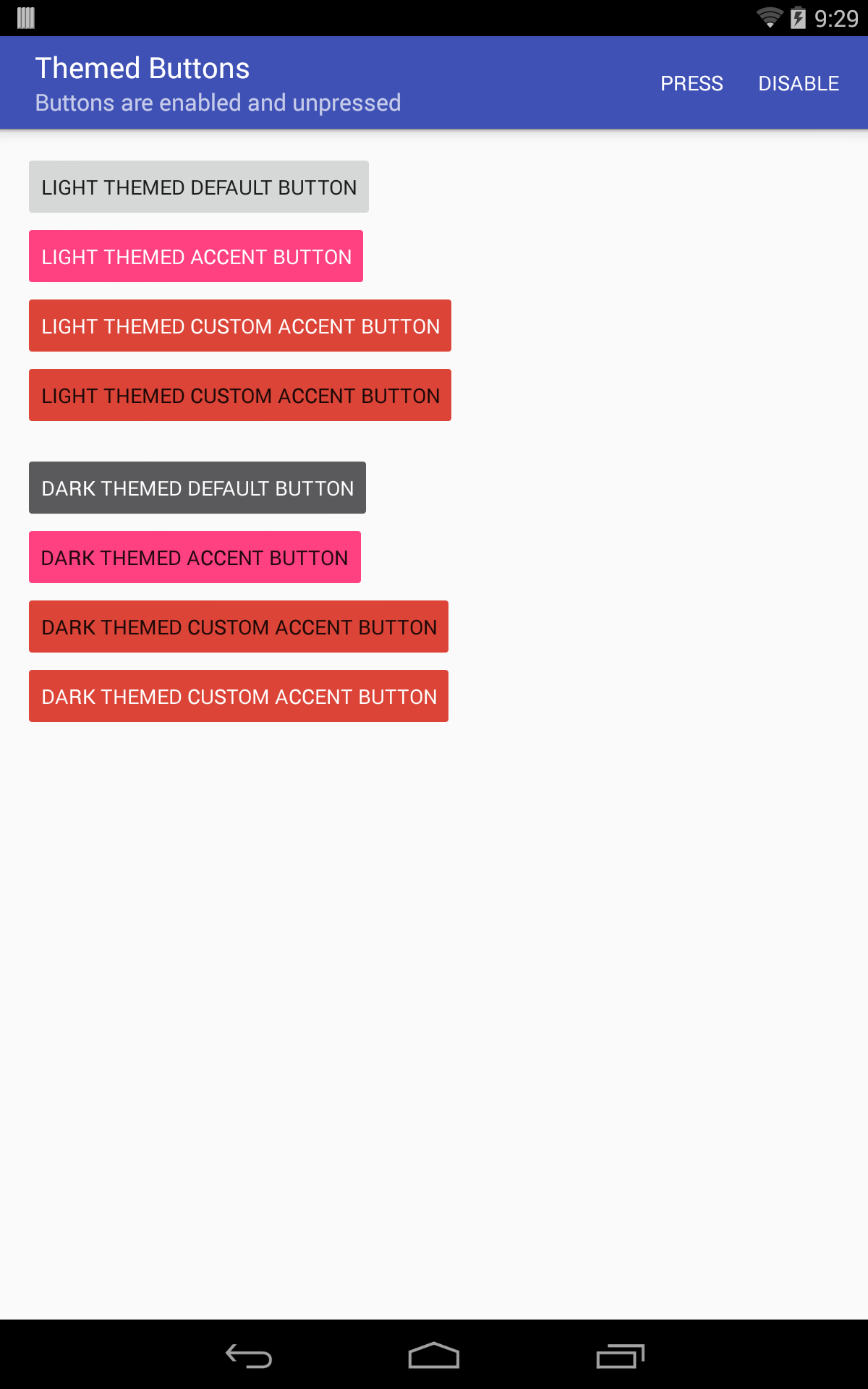
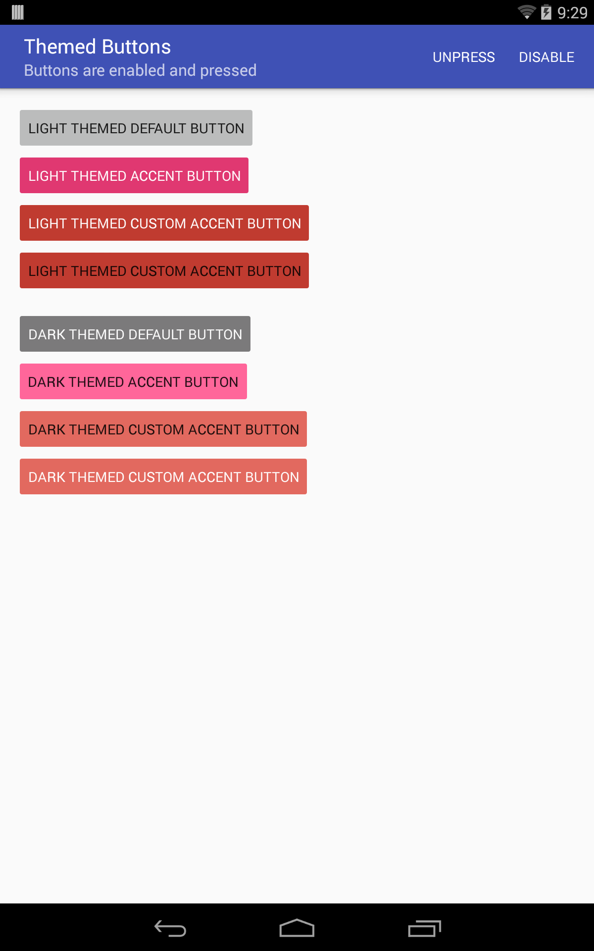
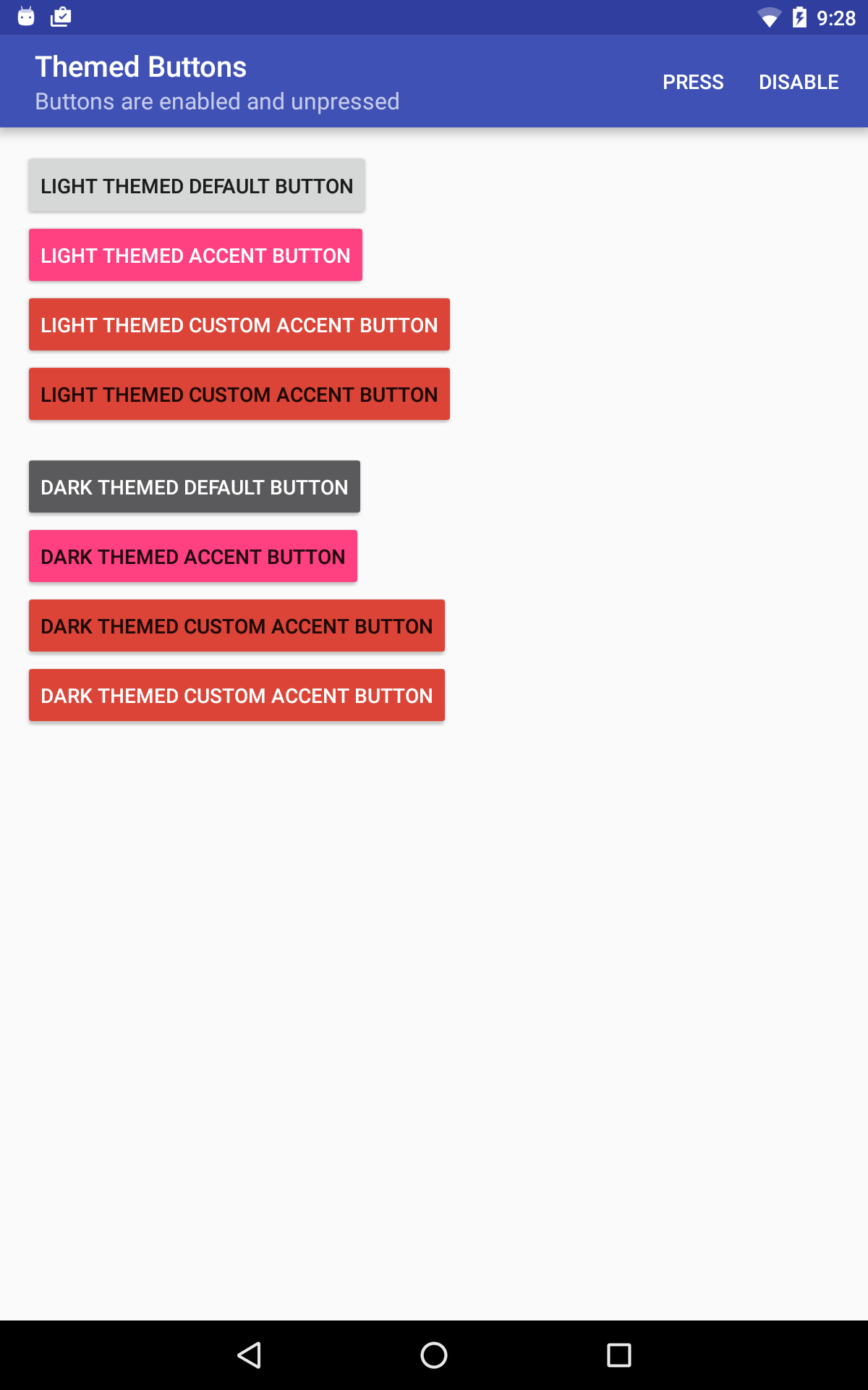
下面xml中的按钮在默认、按下、关闭等状态时,在API 19 and API 23的设备会是什么样子的呢?
<LinearLayout
    android:layout_width="match_parent"
    android:layout_height="wrap_content"
    android:orientation="vertical">

    <Button
        android:layout_width="wrap_content"
        android:layout_height="wrap_content"/>

    <Button
        style="@style/Widget.AppCompat.Button.Colored"
        android:layout_width="wrap_content"
        android:layout_height="wrap_content"/>

    <Button
        style="@style/Widget.AppCompat.Button.Colored"
        android:layout_width="wrap_content"
        android:layout_height="wrap_content"
        android:theme="@style/RedButtonLightTheme"/>

    <Button
        android:id="@+id/button4"
        android:layout_width="wrap_content"
        android:layout_height="wrap_content"/>

    <Button
        android:layout_width="wrap_content"
        android:layout_height="wrap_content"
        android:theme="@style/ThemeOverlay.AppCompat.Dark"/>

    <Button
        style="@style/Widget.AppCompat.Button.Colored"
        android:layout_width="wrap_content"
        android:layout_height="wrap_content"
        android:theme="@style/ThemeOverlay.AppCompat.Dark"/>

    <Button
        style="@style/Widget.AppCompat.Button.Colored"
        android:layout_width="wrap_content"
        android:layout_height="wrap_content"
        android:theme="@style/RedButtonDarkTheme"/>

    <Button
        android:id="@+id/button8"
        android:layout_width="wrap_content"
        android:layout_height="wrap_content"
        android:theme="@style/ThemeOverlay.AppCompat.Dark"/>

</LinearLayout>
假设第4和第8个按钮的背景着色是通过如下代码动态设置的:
final int googRed500 = ContextCompat.getColor(activity, R.color.googred500);

final View button4 = activity.findViewById(R.id.button4);
ViewCompat.setBackgroundTintList(
    button4, BackgroundTints.forColoredButton(button4.getContext(), googRed500));

final View button8 = activity.findViewById(R.id.button8);
ViewCompat.setBackgroundTintList(
    button8, BackgroundTints.forColoredButton(button8.getContext(), googRed500));
结论
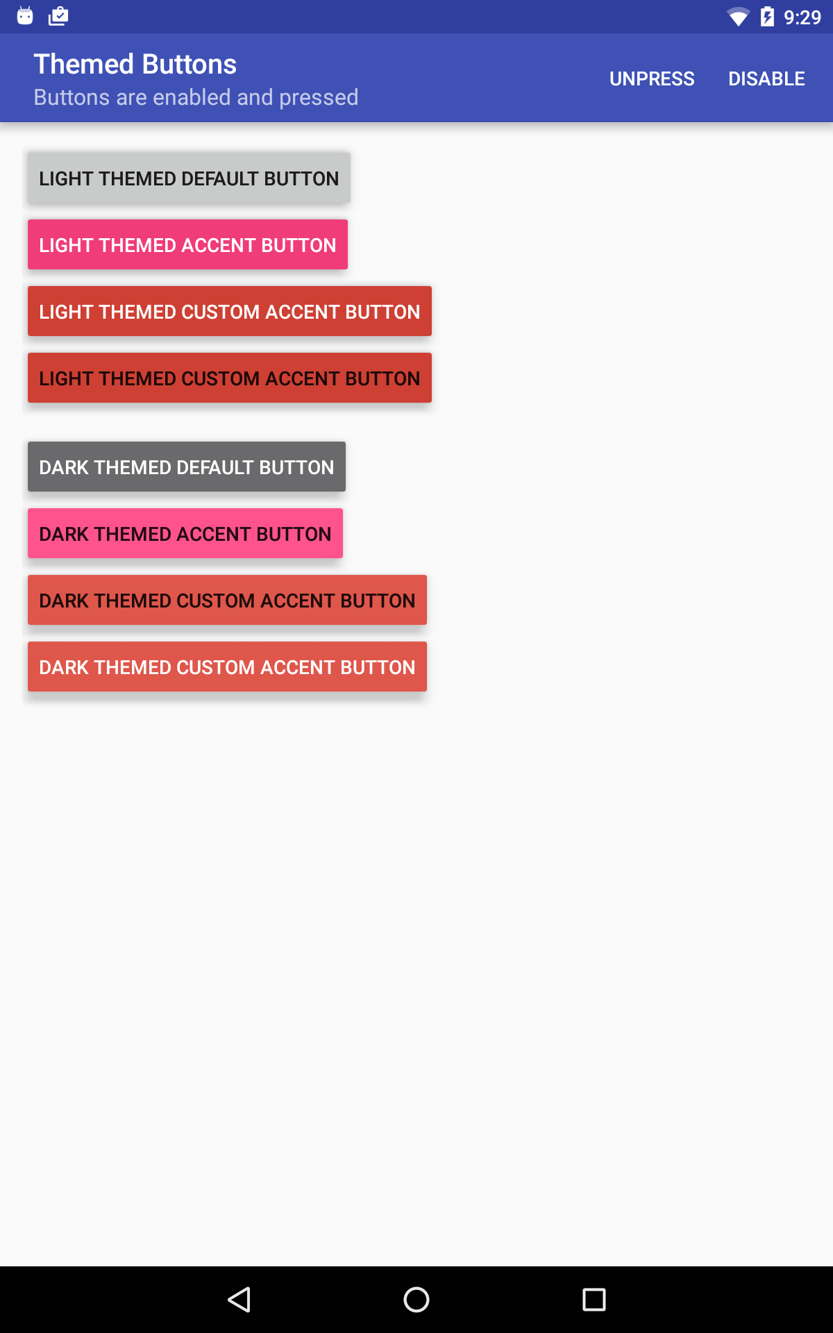
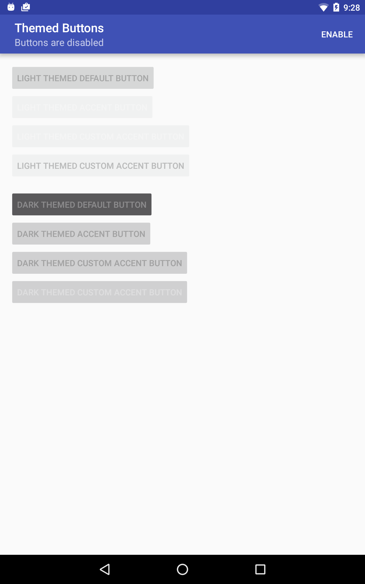
(注意:截图中在disabled状态下的文字颜色错误的显示是一个已知的Bug issue,在support library的下一个版本更新中将得到修复)
源码地址
最后,感谢大家阅读。源码地址:source code for these examples on GitHub